
WEBSITE
EXTENSION
COVID-19 is changing the way humans come in contact with each other and our technology is not yet equipped to support us. This project follows the creation of an Appointment Booking website extension that may be added to an existing webpage and syncs with the office's calendar. COVID-19 precautions are included in the scheduling process.

Project Type: Independent
Timeline: 6 weeks
Role: UX/UI Designer
We Are Constantly Changing
The Challenge: The focus of this project is to focus on the user experience and user interface of the tool. User testing must be completed at various iterations of the design ino order to receive enough feedback.
The Goal: Improve the user experience of an appointment booking tool that includes COVID precautions that may be government regulated.
Skills: Figma & Sketch (Wireframing + Prototyping)
Design Workshop
User Flow
User Research (A/B Testing and Usability Testing)
Design Style Guide
Ideating through a Design Workshop
I gathered three of my colleagues and explained the background information of the project at hand. The team completed a Crazy 8s exercise where each member created a simple concept including an interface, user flow, and/or cautions to watch out for during the design phase.
This workshop was beneficial to me as there were many ideas brought up during the workshop that were missed in my initial work. Observing different design approaches to the problem allowed myself to think of other opportunities and areas that may be covered by my design solution.


Workshop Takeaways
-
Having schedule filters to find the schedule of certain doctors or certain days of availability as the client may have work or other commitments
-
Including other medical practices for more connectivity which may be noted for future improvements
-
Logging in through phone numbers or other information that will not be forgotten as users are less likely to remember their username and password when they only visit twice a year
-
Auto-sync option with the user’s phone or email calendar will also be beneficial with some type of notification to remind the user of the appointment before the appointment date
Always Plan Ahead
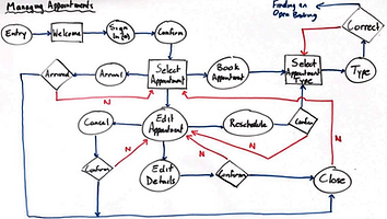
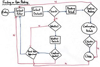
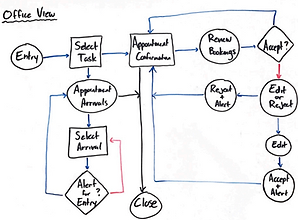
As ideas begin to fly through my head, it's important to pause and begin to plan the design. In doing so, I started off with developing user flows for common tasks such as scheduling an appointment, managing appointments, managing notifications, and the receiving end of the appointment bookings.

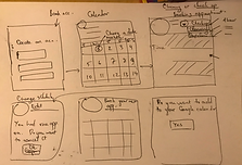
Low Fidelity
With multiple user flows planned out, a low fidelity user interface was sketched to transform the user flow into a usable platform.

Validating My Approach
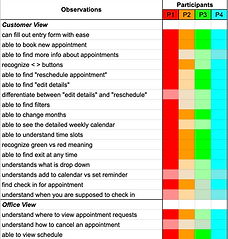
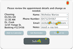
After I decided how my user interface will appear and flow, I created a mid fidelity wireframe mockup of my design in order to person user testing with four potential users.
User Testing Key Takeaways
-
User flow to reschedule appointments was unclear and may need multiple options or clear instructions
-
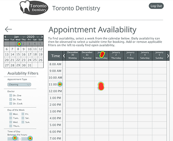
The calendar used to select an appointment space must instantly capture the user's focus
-
Filters including doctor and appointment type must be selected before entered calendar view.


A/B Testing
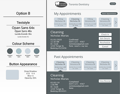
Two style guides that include colour scheme, button style, font styles and sizes, and UI elements were prepared for A/B testing.

The End of the Week
As the product begins to settle into its final design, it is time to create a high fidelity prototype of the wireframe. This wireframe will then undergo user testing using Maze.design with five potential users.

The user testing on Maze.design consisted of four tasks including signing in, editing information of an existing appointment, booking a new appointment, and scheduling an appointment at a specific time using the time slot calendar. The testing was followed up by two questions asking the user how difficult the tasks were and which tasks they had trouble with.
-
Tasks one and two were completed without trouble by all user participants
-
Few users did not initially observe the "Edit Details" button and attempted to directly edit the information in the drop-down
-
-
Task three had the most accurate heat map despite taking the longest to complete
-
Multiple users had difficulty finding the half-hour time slots on the calendar during task four
-
Task three and four seemed to have more issues than the others
-
This may be due to the user not being supplied enough information to confidently fill in the information they are asked for
-

User Testing Key Takeaways
-
Make it clear to the user the steps to edit their information and increase user flow
-
Drive more focus to the "Edit Details" button, make the information open the "Edit Details" pop-up upon double clicking, etc.
-
-
Increase the HCI when interacting with the calendar
-
Inform the user what time is selected on the calendar through colour, labeling, etc.
-
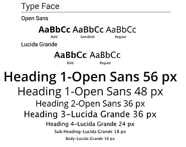
Design Style Guide
A design style guide for the product mockup was created which includes all font styles, font size, colour schemes, form styles, and button styles used in the design.


Project Learnings
This is the first time I created a detailed user interface and repeatedly conducted user testing to receive product feedback.
-
Start with a blank slate. When solving a design problem, it's important to not have predetermined biases present that will affect the outcome of your design. Start from a blank state of ideas, layout, design styles, etc. Being open will lead you to welcome proper feedback and new ideas that you were unable to think of.
-
Initial research will prevent future problems. Unfortunately, before this project began I did not have time to complete initial research. Towards the end of this project, I began to regret not pausing and conducting a competitive analysis to observe how others tackled issues before I even encountered those issues. Initial research can allow the designer to be aware of problems and solutions before the designer encounters them for themselves.